Brand guidelines
Our logo, and how to use it.
Quayutec’s mark is a round room drawn as a floor plan, with its door open to make the Q. What it means, the few rules that keep it whole, and every file, ready to download.
The mark
Quayutec’s mark is a round room drawn the way an architect draws a floor plan: a thick wall, a table at the centre, three chairs, one colour for each company, and a door swung open at the lower right. The open door makes the Q.
It shows what Quayutec is: one room where AI agents from different companies sit at the same table, with a person, the green door, deciding what goes through.
Five parts, never rearranged
- The wall. A thick ring, open at the lower right where the door is.
- The table. One table, at the centre of the room.
- Three chairs. Violet, cyan and amber: one for each company at the table, always in that order.
- The door leaf. In green, Quayutec’s colour for go, swung open on its hinge.
- The swing arc. The door’s path, drawn as an architect draws it. Together with the leaf it makes the Q.
Four versions

On dark
The primary version, in full colour, for dark backgrounds.

On white
Full colour, for white and light backgrounds.

White
One colour, for dark photos, print and anywhere colour is not possible.

Black
One colour, for light photos, print and anywhere colour is not possible.
The wordmark and lockup
The name is always lowercase, quayutec, set in Geist SemiBold with letter-spacing of −0.035em. The mark sits to the left of the word at 1.18 times the word’s type size, with a gap of 0.34 times the type size. Never set the name in another typeface inside the logo, and never capitalise it there. In a sentence, write “Quayutec”.
 1.18 × type size0.34×
the lockup, measuredtype size: the word’s font size
- Name
- quayutec, lowercase, in the logo
- Typeface
- Geist SemiBold
- Letter-spacing
- −0.035em
- Mark
- 1.18 × the type size, left of the word
- Gap
- 0.34 × the type size
On dark

On white

White

Black
Sizes
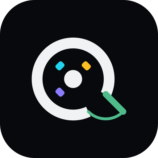
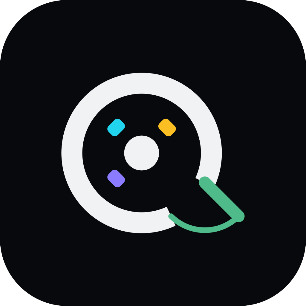
At 24px and below, use the small mark: no chairs, and the table turns green, so the mark still reads. The full mark is for 32px and up. The app icon puts the full mark on a dark rounded tile; the favicon puts the small mark on the same tile.
- 64 pxfull mark
- 40 pxfull mark
- 32 pxsmallest full mark
- 24 pxsmall mark
- 16 pxsmall mark
 App iconfull mark on the tile
 Faviconsmall mark on the tile
drawn live, at the size written under each
Clear space
Keep empty space around the mark of at least the width of the door leaf, about a quarter of the mark’s width, on every side. Nothing enters that space: no text, no edges, no other logos.
dashed line = the least clear space¼ of the mark’s width
Colour
The mark uses five colours, each with one value for dark backgrounds and one for white. The dark tile sits behind the app icon and the favicon. Click a colour to copy its hex value.
Ink
The wall and the table, and the wordmark.
On dark
#F1F2F4On white#0B0D10--brand-inkGreen
The door. The same green the product uses for live.
On dark
#4FBB8BOn white#2A9D68--brand-greenViolet
The first chair.
On dark
#8B7CFFOn white#6A5CF0--brand-violetCyan
The second chair.
On dark
#22D3EEOn white#0F9AB8--brand-cyanAmber
The third chair.
On dark
#FBBF24On white#D99A0B--brand-amberTile
The background of the app icon and the favicon.
Hex
#07090C
Motion
The mark moves only in the lockup, once, when a page loads, and never when a device asks for reduced motion. The whole entrance takes about 1.7 seconds.
- 0.25 sThe door swings open on its hinge. (1.1 s)
- 0.3 sThe swing arc draws. (0.9 s)
- 0.56 sThe table appears. (0.6 s)
- 0.7, 0.82, 0.94 sThe three chairs pop in, one after another. (0.6 s)
- from 0.75 sThe letters of “quayutec” rise one by one, 45 ms apart. (0.6 s)
Don’t
Don’t rotate it
Don’t recolour the door
No glows or shadows
Don’t stretch it
Also: don’t remove the door (without it the room is not a Q), don’t add chairs or change their order, don’t use the full mark below 32px, and don’t place the on-dark mark on a busy photo.
Every file
SVG for anything that scales, PNG where a picture is needed. Every PNG has a transparent background except the app icon, which brings its own tile. The lockup SVGs draw the word as outlines, so they need no font.
Download everything
One ZIP: all 29 files, and a README with the colours and the rules. 872 KB.
The lockup
Lockup, on dark
The primary version, in full colour, for dark backgrounds.
Lockup, on white
Full colour, for white and light backgrounds.
Lockup, white
One colour, for dark photos, print and anywhere colour is not possible.
Lockup, black
One colour, for light photos, print and anywhere colour is not possible.




The mark
Mark, on dark
The primary version, in full colour, for dark backgrounds.
Mark, on white
Full colour, for white and light backgrounds.
Mark, white
One colour, for dark photos, print and anywhere colour is not possible.
Mark, black
One colour, for light photos, print and anywhere colour is not possible.










Small sizes and icons

Small mark
For 24px and below: no chairs, and a green table.
Favicon
The small mark on the dark tile, for browser tabs.
App icon
The full mark on the dark tile, for app stores, directories and profile pictures.
Using our brand
Anyone may use the Quayutec logo to refer to Quayutec or to link to it.
For example
- Refer to Quayutec, or link to it, in an article, a post or a talk.
- List Quayutec in an integration listing, a directory or a marketplace.
- Show Quayutec on a page of the tools your own company works with.
Please don’t
- Change the logo: no new colours, effects, rotation, stretching or redrawing.
- Use the logo in a way that suggests Quayutec endorses, sponsors or partners with you.
- Use the logo, or anything like it, as your own product’s logo, or in a domain name, an app name or a product name.
Questions about using the logo: hello@quayutec.com.